Building Your Brand: Essential Tips for Architect Logo Design
The Foundation: Core Principles of Architectural Logo Design
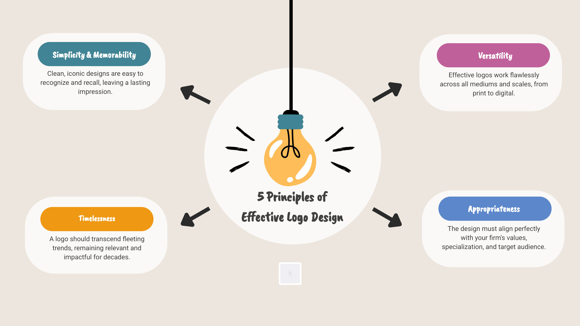
At the heart of every successful architectural logo lies a set of fundamental design principles. These aren’t mere aesthetic preferences; they are strategic pillars that ensure your logo effectively communicates your firm’s identity and values. Understanding these principles is the first step in crafting a visual mark that stands the test of time and resonates with your target audience.
We believe that a strong architectural logo should embody:
- Simplicity: A clean, uncluttered design that is easy to understand and recall.
- Memorability: A distinctive mark that leaves a lasting impression.
- Timelessness: A design that remains relevant and impactful for years, avoiding fleeting trends.
- Versatility: A logo that functions effectively across all platforms and sizes, from a business card to a billboard.
- Appropriateness: A design that aligns with the professionalism, style, and specialization of an architectural practice.
Beyond these core attributes, architectural logos often leverage specific design styles to convey their message. Symbolism might use abstract shapes or literal representations of buildings or tools. Abstract marks create unique, non-representational forms that evoke a firm’s ethos. Wordmarks, or logotypes, rely solely on stylized text to form the logo, often emphasizing the firm’s name. Each approach has its merits, depending on the desired brand perception.
Why Simplicity and Memorability Matter
In a world saturated with visual information, simplicity is not merely a design choice; it’s a strategic imperative. A simple logo is inherently more memorable. When a logo is stripped down to its essential elements, it becomes easier for the human brain to process, recognize, and recall. For an architectural firm, this means your brand stays top-of-mind when potential clients are considering their next project.
Consider the power of clean lines and geometric shapes. These elements inherently convey precision, structure, and order – qualities deeply valued in architecture. They create a sense of stability and professionalism. The strategic use of negative space can further improve simplicity, allowing hidden meanings or secondary forms to emerge, adding depth without adding clutter. This intelligent use of space not only makes a logo more visually interesting but also aids in its memorability.
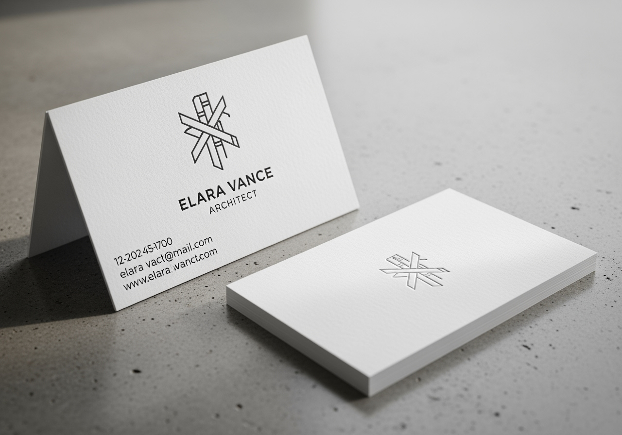
Furthermore, simplicity directly impacts scalability. An architectural logo must look crisp and legible whether it’s tiny on a favicon, embossed on a letterhead, or emblazoned on a large construction site sign. Complex designs with intricate details or too many colors often lose their integrity when scaled down, becoming blurry or indistinguishable. By avoiding unnecessary complexity, you ensure your logo maintains its impact and clarity across all applications, reinforcing a consistent brand identity. This ease of recognition and versatility across various media is paramount for effective brand communication and client recall in the architectural sphere.
Reflecting Your Firm’s Unique Style and Specialization
Your architectural firm is unique, and your logo should be too. It’s not enough for a logo to simply look “architectural”; it must reflect your firm’s specific values, design philosophy, and areas of specialization. This is where the logo transcends mere aesthetics and becomes a powerful tool for strategic positioning.
For instance, a firm specializing in cutting-edge, modernist designs might opt for a sleek, minimalist wordmark with a sans-serif typeface and a monochromatic palette, conveying innovation and forward-thinking. In contrast, a firm rooted in traditional or classical architecture might choose a logo with serif fonts, perhaps incorporating an emblem or a more ornate symbol that speaks to heritage and enduring craftsmanship.
If your firm champions sustainability or eco-friendly building practices, your logo could subtly integrate organic shapes, natural color palettes (greens, earthy tones), or symbols that allude to growth and environmental harmony. For firms focused on residential projects, a logo might evoke warmth, comfort, and home, perhaps with softer lines or more inviting imagery. Conversely, a firm specializing in large-scale commercial or urban planning projects might use abstract, geometric forms that suggest large structures, precision, and urban development.
Identifying your firm’s Unique Selling Proposition (USP) is crucial here. What makes you different? Is it your innovative approach, your meticulous attention to detail, your historical preservation expertise, or your client-centric process? Your logo should subtly or overtly convey this expertise, acting as a visual shorthand for your brand promise. By carefully aligning your logo’s style, imagery, colors, and typography with your firm’s core values and specialization, you create a cohesive brand identity that attracts the right clients and effectively communicates who you are and what you stand for.
The Blueprint: Key Considerations for Logo Design for Architects
Once the foundational principles are understood, the next step involves delving into the specific visual language that will define your architectural logo. Every element, from the choice of color to the curve of a letter, contributes to the overall brand perception and influences how clients psychologically connect with your firm. The goal is to create a cohesive visual narrative that speaks directly to your target audience.
Choosing a Color Palette That Builds Trust
Color is a powerful psychological tool in logo design, capable of evoking emotions, conveying professionalism, and building trust. For architectural firms, the choice of color palette is particularly significant as it can subtly communicate stability, innovation, and reliability.
Many successful architectural logos gravitate towards a sophisticated, often restrained, palette. Black is a perennial favorite, signifying luxury, sophistication, strength, and authority. It provides a timeless and neat foundation. Grey is another strong contender, representing balance, precision, and professionalism. It offers a neutral, understated elegance that allows other elements to shine while maintaining a serious and reliable image. Blue, particularly deeper shades, is often associated with trust, efficiency, intelligence, and stability – qualities highly valued in the architectural and engineering fields. It suggests reliability and a calm, authoritative presence.
While these colors form a strong base, a minimalist approach to color is often best. Sticking to a primary color, perhaps complemented by a secondary and an accent color, prevents visual clutter and improves memorability. Overuse of bright or disparate colors can dilute professionalism and create a chaotic impression.
Before finalizing your palette, it’s wise to conduct a brief competitor analysis. Observe the color choices of other leading architectural firms. This isn’t to copy them, but to understand industry norms and identify opportunities for brand differentiation. Perhaps a subtle, unique accent color can set you apart while maintaining a professional appeal. Your chosen colors should not only look aesthetically pleasing but also strategically reinforce your brand’s message and build confidence with potential clients.
Selecting Typography for Your Architect Logo Design
Typography is more than just text; it’s a visual voice that conveys personality, professionalism, and the very essence of your architectural firm. The fonts you choose for your logo can subtly communicate whether your firm is traditional or avant-garde, established or innovative, meticulous or fluid.
For firms that emphasize heritage, classicism, or enduring quality, serif fontsoften resonate best. Their decorative strokes and varied line weights evoke a sense of tradition, sophistication, and reliability. They can feel more “expensive” and established, aligning with a practice that values timeless design principles.
Conversely, sans-serif fonts (without serifs) are widely favored by modern architectural firms. Their clean, unadorned lines communicate modernity, simplicity, and efficiency. They often appear more approachable and contemporary, making them ideal for firms pushing the boundaries of design or focusing on minimalist aesthetics. Within sans-serifs, geometric typefaces can convey precision and structure, while humanist sans-serifs might offer a warmer, more neat feel.
Beyond the choice between serif and sans-serif, consider font weight and hierarchy. A bold, heavy typeface can convey strength and solidity, while a lighter weight might suggest refinement and elegance. The judicious use of different weights within a wordmark can create visual interest and emphasize key elements. Letter spacing (kerning) is also critical; tightly set letters can create a sense of boldness and unity, while wider spacing can imbue an airy, sophisticated quality.
Most importantly, ensure your chosen typography offers excellent readability across all sizes. A beautiful font is useless if it becomes illegible when scaled down for a business card or website favicon. Test your logo’s legibility on various mockups to ensure clarity. By carefully selecting and refining your typography, you imbue your architectural logo with a distinct personality that resonates with your target audience and reinforces your firm’s unique brand identity.
The Design Process: From Concept to Final Asset
The journey from an abstract idea to a tangible, impactful logo is a structured process involving creativity, strategic thinking, and iterative refinement. It typically begins with a thorough design brief, where the core values, target audience, and unique selling propositions of the architectural firm are clearly articulated. This brief serves as the compass for the entire design expedition.
Following the brief, the designer starts on sketching and ideation. This phase is about exploring a wide range of concepts, from literal interpretations to abstract representations. It’s a period of uninhibited creativity, where numerous possibilities are laid out. These initial sketches then undergo iteration and refinement, where promising concepts are developed further, polished, and tested against the initial brief. This cyclical process of creating, evaluating, and improving is crucial for honing the design. Throughout, client feedback is invaluable, ensuring the evolving design stays true to the firm’s vision and meets its strategic objectives.
DIY Logo Makers vs. Professional Designers
When it comes to creating an architectural logo, firms often face a choice: use an online DIY logo maker or invest in a professional designer. Each approach has distinct advantages and disadvantages, particularly for a field that demands precision, sophistication, and a strong brand identity.
| Feature | DIY Logo Makers | Professional Designers |
| Cost | Low to free (subscription or one-time download) | Higher (project-based or hourly fees) |
| Time | Immediate results | Weeks to months (depending on project complexity) |
| Customization | Limited to templates and pre-set options | Unlimited, bespoke design custom to specific needs |
| Strategic Input | Minimal; no brand strategy guidance | Extensive; includes brand strategy, market research, and conceptual development |
| Uniqueness | Risk of generic or similar designs | High; unique, proprietary design |
| File Formats | Basic (JPG, PNG); vector often extra | Comprehensive (all vector and raster formats, brand guidelines) |
| Support | Self-service, limited customer support | Direct collaboration, revisions, ongoing support |
DIY logo makers offer undeniable speed and cost-effectiveness. They are excellent for quick, basic needs or for small startups with extremely limited budgets. You can generate a logo in minutes and have a visual identity almost instantly. However, their reliance on templates means that true uniqueness can be elusive, and the strategic depth required for a strong architectural brand is often missing.
On the other hand, hiring a professional designer, particularly one experienced in the AEC industry, is an investment in your brand strategy. A designer will dig deep into your firm’s philosophy, target market, and competitive landscape. They don’t just create a pretty picture; they craft a visual solution that strategically positions your firm, resonates with your ideal clients, and stands out in a competitive market. This bespoke approach ensures your logo is unique, meaningful, and future-proof. For comprehensive insights into the process and benefits of working with experts, explore resources on Custom logo design for architects. While the upfront cost is higher, the long-term value in terms of brand recognition, credibility, and market differentiation often far outweighs the initial expense.
Avoiding Common Pitfalls in Logo Design for Architects
Even with the best intentions, certain missteps can undermine the effectiveness of an architectural logo. Being aware of these common pitfalls can save time, resources, and ensure your final design truly serves your brand.
One significant trap is creating overly complex designs. While it might seem tempting to incorporate every aspect of your firm’s capabilities or values into a single logo, this often results in a cluttered, illegible, and ultimately forgettable mark. As discussed, simplicity is key to memorability and versatility. Avoid intricate details that disappear when scaled down or become difficult to reproduce.
Another pitfall is blindly following fleeting trends. Design trends come and go, and a logo designed purely to be “trendy” can quickly look dated, necessitating an expensive redesign. While it’s good to be aware of current aesthetics, a truly timeless logo transcends fads, focusing instead on enduring principles and your firm’s core identity.
Poor scalability is a practical disaster. A logo that looks great on a large screen but pixelates on a business card or is unreadable on a pen is a failed logo. Always design with versatility in mind, ensuring your logo maintains its integrity and impact across all sizes and media. This also relates to ignoring versatility in application – think beyond just digital. How will your logo look embroidered on uniforms, etched into glass, or rendered in a monochrome blueprint?
Using irrelevant imagery is another common mistake. While a building icon might seem obvious, if it doesn’t represent your firm’s specific style or specialization, it can be generic or even misleading. Similarly, abstract shapes or symbols should still have a conceptual link to your brand, even if subtle.
Finally, font and color misuse can severely damage your brand perception. Choosing fonts that clash with your firm’s personality (e.g., a playful font for a serious commercial firm) or a color palette that evokes the wrong emotions (e.g., overly bright colors for a luxury residential firm) can create dissonance and undermine trust. Every element in your logo should be a deliberate choice that reinforces your brand message. By steering clear of these common errors, you can ensure your architectural logo is not just visually appealing but also strategically sound and functionally effective.
Frequently Asked Questions about Architect Logos
What are the current trends in architecture logo design?
While timelessness should always be a goal, being aware of current design sensibilities can help ensure your logo feels contemporary without being overly trendy. Several trends are prevalent in architectural logo design:
- Minimalism: Clean, uncluttered designs with ample negative space continue to dominate. This reflects a desire for clarity, precision, and sophistication.
- Geometric Wordmarks: Many firms are opting for wordmarks (text-only logos) where the typography itself is highly stylized, often incorporating geometric shapes or precise line work within the letters to evoke structure and design principles.
- Line Art and Outlines: Simple, neat line art, often depicting abstract architectural forms, building outlines, or symbolic structures, is popular. This style is clean, versatile, and easily scalable.
- Use of Negative Space: Clever integration of negative space to reveal secondary images or create optical illusions adds depth and memorability without adding complexity.
- Monochromatic or Limited Color Schemes: Black, white, grey, and deep blues remain popular, often used in monochromatic palettes or with a single accent color, reinforcing professionalism and elegance.
- Subtle Gradients: When color is used, subtle, sophisticated gradients can add a modern touch without overwhelming the design.
These trends often emphasize clarity, precision, and a modern aesthetic, aligning well with the core values of the architectural profession.
What file formats are essential for a versatile logo?
To ensure your architectural logo can be used effectively across all platforms and applications, it’s crucial to obtain it in a variety of file formats. These can broadly be categorized into vector and raster files:
- Vector Files (SVG, AI, EPS): These are the most important formats for your primary logo. Vector graphics are created using mathematical equations, meaning they can be scaled to any size (from a tiny icon to a billboard) without losing quality or becoming pixelated.
- SVG (Scalable Vector Graphics):Excellent for web use, especially for responsive designs.
- AI (Adobe Illustrator): The native file format for Adobe Illustrator, ideal for designers and professional printing.
- EPS (Encapsulated PostScript):A versatile vector format compatible with various design software and print applications.
- Raster Files (PNG, JPG): These are pixel-based images, suitable for digital use and specific print applications where high resolution is maintained.
- PNG (Portable Network Graphics): Essential for digital use, especially because it supports transparency. This allows your logo to be placed seamlessly on any background (e.g., on your website, social media profiles).
- JPG (Joint Photographic Experts Group): Best for photos or images where a white or solid background is acceptable. It does not support transparency.
Always ensure you receive your logo in vector formats, as these are your master files. You should also receive high-resolution PNGs (with transparent backgrounds) and JPGs for immediate web and digital use. Having these diverse formats guarantees your logo’s versatility and professional appearance everywhere it’s displayed.
How does a logo contribute to an architect’s marketing ROI?
While directly quantifying the Return on Investment (ROI) of a logo can be challenging, its contribution to an architect’s marketing efforts and overall business success is profound and multifaceted. A strong logo is not just an expense; it’s a strategic investment that yields significant returns.
Firstly, a well-designed logo significantly boosts brand recognition. It’s the visual shorthand that helps clients remember your firm amidst a sea of competitors. The more memorable and professional your logo, the easier it is for potential clients to recall your services when a need arises. This reduces the effort and cost associated with constantly re-introducing your brand.
Secondly, it directly impacts perceived value and professional credibility. A sophisticated, thoughtfully designed logo signals that your firm is detail-oriented, reliable, and takes its work seriously. This perception builds trust even before a direct interaction, making potential clients more likely to engage with your services. Conversely, a poorly designed or generic logo can inadvertently convey a lack of professionalism, potentially costing you valuable leads.
Moreover, a logo is the foundational element for all marketing materials. From your website and business cards to proposals, signage, and social media profiles, your logo provides consistency and cohesiveness. This consistent visual identity reinforces your brand message across every touchpoint, strengthening your firm’s presence and making your marketing efforts more effective.
Studies have shown that design-driven companies often outperform their peers. For instance, according to the Design Management Institute, design-driven companies have outperformed the S&P by 228% over ten years. While this isn’t solely about logos, it underscores the power of investing in strong design principles across all aspects of a business. A compelling logo is often the first and most visible manifestation of a firm’s commitment to design excellence. By investing in a high-quality logo, architects are not just buying an image; they are investing in their firm’s reputation, market positioning, and long-term growth potential, ultimately contributing to a positive marketing ROI.
Conclusion
Your architectural logo is far more than a simple graphic; it is a powerful emblem of your firm’s identity, values, and aspirations. It serves as the initial handshake with potential clients, setting the tone for your professionalism, precision, and unique design philosophy. As we’ve explored, crafting an effective logo is a strategic process that demands attention to core principles like simplicity, memorability, and timelessness, alongside careful consideration of color, typography, and versatility.
Investing wisely in your logo design is a foundational investment in your brand. Whether you choose to collaborate with a professional designer to open up bespoke strategic insights or use a DIY tool for immediate needs, the goal remains the same: to create a visual mark that accurately represents your firm and resonates with your audience. By avoiding common pitfalls and understanding the nuances of architectural branding, you ensure your logo contributes significantly to your firm’s brand recognition, perceived value, and overall marketing success.
A strong, consistent logo builds trust with clients, communicates your unique specialization, and positions your firm as a leader in the architectural landscape. It is the visual anchor that ties all your marketing efforts together, fostering a cohesive and memorable brand experience. Take the time to craft a logo that truly reflects the excellence and artistry of your architectural practice. It’s an investment that will continue to yield dividends, building a solid foundation for your firm’s future success.