Optimizing User Selection: Radio Button Design Strategies for Mobile Apps
Key Takeaways
- Use radio buttons for single, mutually exclusive choices to minimize user errors.
- Clear labels, appropriate sizing, and consistent circular shapes are essential for usability.
- Proper spacing and limited option counts reduce cognitive load.
- Prioritize accessibility with features like alternative text and keyboard navigation.
- Avoid common missteps, such as misusing checkboxes or offering too many options in one group.
Table of Contents
- Understanding Radio Buttons
- Best Practices for Radio Button Design
- Common Pitfalls to Avoid
- Enhancing Accessibility
- Conclusion
Creating seamless and intuitive mobile app experiences starts with the small details, and radio buttons are among the most fundamental UI elements. These tiny selectors exert an outsized influence on how users understand and interact with choices in your app. Thoughtful radio button design ensures users can make decisions quickly, accurately, and without confusion, which directly affects the overall usability of your mobile interface.
How a radio button interacts with other elements, through its shape, label, placement, and spacing, determines whether your user feels in control or frustrated. For product teams aiming to boost engagement and satisfaction, refining the look and function of radio buttons is a simple yet powerful adjustment. While radio buttons are most often associated with quick, binary decisions (like picking a payment method), their effectiveness relies on subtle visual cues and the context in which they’re deployed. Using these UI components as intended not only maintains interface consistency but also improves navigation flows and accessibility. Elements such as label clarity, proper sizing, and grouping can transform a cluttered screen into a user-friendly experience. Furthermore, research confirms that the act of reducing cognitive load, such as by limiting user options or separating interactive targets, results in faster and more accurate selections. This attention to micro-interactions, like those enabled by well-designed radio buttons, is crucial for any modern app looking to stand out.
Understanding Radio Buttons
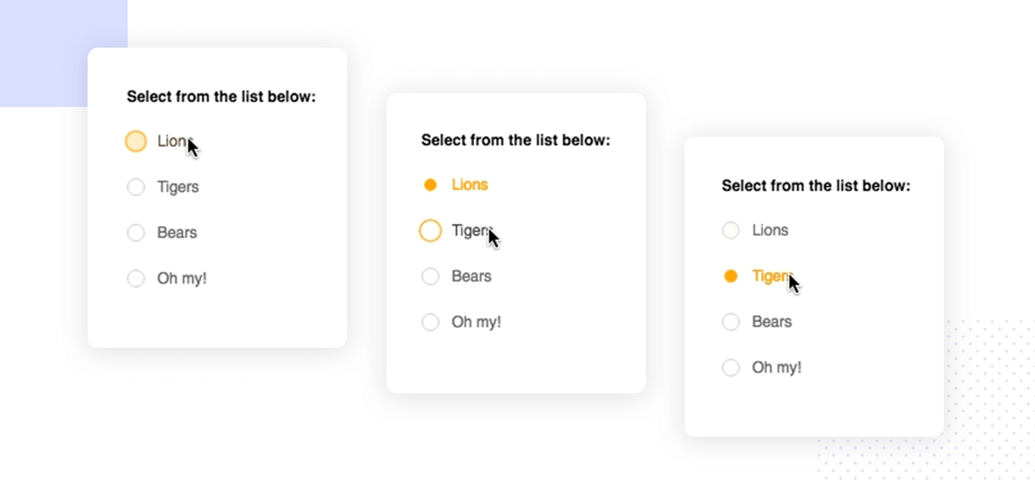
Radio buttons are standard interface elements that enable users to select a single option from a defined set. Typically represented as small, unfilled circles that fill upon selection, radio buttons serve as visual cues for exclusive choices. Users can navigate the available options but may pick only one at a time, making these buttons best suited for straightforward, non-redundant choices within the same category. In mobile applications, the clarity of selection states, unselected versus selected, is crucial. Unlike checkboxes, which allow multiple selections, radio buttons accept only a single answer from a group. Their name derives from the mechanical car radios of the past, which allowed only one frequency to be selected at any time, providing clarity and focus for the user.
Best Practices for Radio Button Design
Use for Mutually Exclusive Choices
Deploy radio buttons exclusively for cases where only one response is allowed. For example, letting a user pick a shipping method or designate their notification preferences is an ideal use case for this element. When multiple choices are permitted, checkboxes are the preferred option to prevent user confusion and unintentional errors.
Provide Clear and Concise Labels
A short, specific label should accompany each radio button. Avoid generic tags like “Option A” or “Selection 1”; instead, offer direct information about each choice so users can quickly gauge the outcome of their selection. Engaging, action-specific language not only supports accessibility but also aligns with mobile usability standards set by leaders.
Ensure Proper Spacing and Sizing
Accurate touch targets are essential on mobile devices, where finger taps replace mouse clicks. Google’s Material Design recommends a minimum tap target of 48×48 pixels. Consistent spacing between buttons prevents accidental taps and streamlines the interaction process, particularly for users with varying dexterity or device screen sizes.
Maintain Consistent Design
Radio buttons are traditionally round, not square or custom-shaped, a familiar trait that cues users to their purpose. Unifying the style, such as using a standard shade or a consistent fill method across components, reduces the cognitive effort required to scan and select an option. Deviating from these conventions can lead to hesitation or dissatisfaction.
Limit the Number of Options
When radio button groups contain too many items, decision-making speed plummets. Limit the group to about 2-5 options for optimal performance. If the question demands more inputs, consider replacing the group with a dropdown menu or breaking the process into multiple steps.
Common Pitfalls to Avoid
Poor Labeling and Instructions
Missing, vague, or duplicated labels hinder quick comprehension, leading to errors or incomplete forms. Users benefit from descriptive titles, brief explanatory notes, and visible grouping. Providing specific instructions or contextual hints for each group will guide users smoothly through the interface.
Misuse of Radio Buttons vs. Checkboxes
Mistaking checkboxes for radio buttons can confuse, as users expect checkboxes to allow multiple, independent selections. Align the control with the intent (radio for one, checkbox for many), and your users will better understand your app’s workflow.
Inadequate Touch Targets
Small targets or insufficient spacing often lead to incorrect selections, especially for users with large fingers or those operating devices one-handed. Always adhere to platform guidelines regarding touch area dimensions, and leave enough space between elements for easy navigation.
Enhancing Accessibility
Accessible radio buttons guarantee that everyone, regardless of physical ability, can interact with your app. Begin by ensuring high color contrast between the button, text, and background, which benefits users with visual impairments. Include concise alternative text for each button so screen readers can announce the available choices. Provide keyboard-friendly navigation, allowing users to navigate options with keystrokes if touch controls aren’t feasible. Conduct user testing with assistive tools to identify obstacles or friction points early in the development process. Making these adjustments helps ensure compliance with widely recognized standards such as the Web Content Accessibility Guidelines (WCAG).
Conclusion
Thoughtful design and intentional use of radio buttons create powerful improvements in mobile app usability. By implementing best practices, including precise labeling, proper sizing, intuitive grouping, and strict adherence to accessibility protocols, teams foster confidence and satisfaction among users. Avoiding common design mistakes, such as overloading options or creating ambiguous controls, will further streamline the user experience. Attending to these details in your radio button design can set your app apart and ensure it is functional for the broadest possible audience.


