Proven Strategies for Crafting Effective Top Navigation in Modern Web Design
Key Takeaways
- Intuitive navigation enhances user experience and engagement.
- Consistency and simplicity are key to effective navigation design.
- Mobile responsiveness is essential for modern web navigation.
- Clear labeling and logical categorization improve usability.
- Regular testing and updates ensure navigation remains effective.
Creating an intuitive top navigation bar is foundational for a seamless user experience and helps visitors quickly find information from the moment they land on your site. Effective navigation bar design sets the tone for overall usability and can dramatically improve engagement and retention. By focusing on constructive strategies and usability principles, you ensure your website is both accessible and user-friendly.
The navigation bar is typically the entry point for users to explore your site, making its usability critical for both first-time visitors and returning customers. If users cannot find what they need or if navigation feels cumbersome, they are far more likely to abandon your website. Navigation systems should support effortless browsing while reflecting your site’s structure in a logical, predictable way.
Recent research from large usability firms indicates that users decide within seconds whether to stay on a website, often based on how easily they can understand and interact with the navigation. Making clear, rational design choices ensures you meet modern users’ expectations for speed and simplicity.
As digital behaviors evolve and technologies shift, your website navigation approach must stay current with best practices. Ensuring an intuitive navigation structure aligns your site with standards embraced by leading design experts and enhances accessibility for all users.
Importance of Intuitive Navigation
Intuitive navigation forms the backbone of successful websites. It ensures that users do not waste time searching for basic information and enables them to explore your content organically. A study by the Nielsen Norman Group highlights that clear navigation structures are vital for keeping users engaged, as most people expect to complete their goals within 10 to 20 seconds of landing on a site. A well-organized navigation menu reduces frustration, builds trust, and directly influences overall satisfaction.
Strong navigation is not just about user retention; it also boosts the effectiveness of your content by guiding users through their journey in a deliberate, structured manner. This helps reduce support requests and frequently asked questions, supporting your business goals while streamlining user interactions.
Keeping Navigation Simple and Consistent
Simplicity in design reduces confusion while boosting navigational efficiency. Sites that err on the side of minimalism, with clear signposting and consistent layouts, make it effortless for visitors to predict where content is located. According to a user experience survey by GoodFirms, nearly 62 percent of visitors are driven away by complicated or confusing navigation. Maintaining consistency across your entire website ensures familiarity and reliability, key factors in establishing user confidence.
Use a consistent visual language, spacing, and menu placement to minimize learning curves. Align navigation items with user priorities and avoid clutter. This keeps the interface approachable and sharp, regardless of device or context.
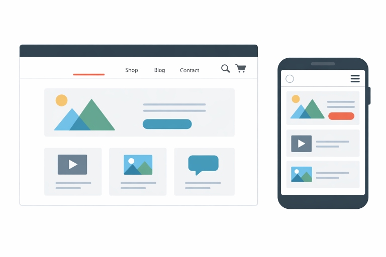
Designing for Mobile Users
Mobile traffic surpassed desktop traffic in recent years, underscoring the necessity of responsive navigation. Designing with mobile-first principles ensures your navigation adapts fluently to different screen sizes and touch-centric controls. Techniques such as sticky navigation bars, hamburger menus, and larger clickable areas contribute to a mobile-friendly experience.
Users on mobile devices expect speed, clarity, and accessibility. Optimize the top navigation for small screens by minimizing menu items, using legible fonts, and maximizing touch targets. Mobile-friendly navigation is about providing users with the simplest, fastest path to their desired goals without overwhelming them with excessive choices.
Using Clear Labels and Logical Categorization
Users should never have to guess where a navigation link might take them. Use universally understood terms such as “Shop,” “Blog,” or “Contact” to set accurate expectations before users click. Avoiding branded jargon and prioritizing user-centric language increases ease of use. Additionally, group-related links are logically organized under broad categories, streamlining access to deeper or more specific content.
Organized, clear navigation not only helps with usability but can also boost your search engine optimization (SEO) efforts by improving how search engines interpret and index your site.
Implementing Effective Search Functionality
On content-rich or e-commerce websites, a prominent and reliable search bar is essential. It acts as a dynamic companion to your navigation menu, enabling users to quickly locate desired topics, products, or information. Ensure the search feature is immediately visible, preferably at the top of every page, and delivers highly relevant results, thereby enhancing users’ perception of your site’s depth and usability.
Just as with your main navigation, routinely test and analyze search functionality to ensure it aligns with evolving user needs and delivers a robust, satisfying experience.
Testing and Updating Navigation Regularly
Navigation design is not a one-time project; it requires ongoing refinement driven by real user data and feedback. Use analytics tools, heatmaps, and session recordings to identify where users struggle or drop off. Conduct regular usability tests, surveys, and interviews to uncover friction points and new areas for improvement.
As your content grows and user behaviors shift, periodically review and adjust your navigation structure. Small iterative updates maintain alignment with best practices, user preferences, and new web standards. Maintaining this feedback loop ensures your navigation continues to provide value as your website evolves.
Conclusion
Intuitive top navigation remains one of the pillars of modern web design, essential for keeping users engaged and helping them achieve their goals efficiently. By prioritizing simplicity, consistency, mobile responsiveness, clear categorization, effective search functionality, and diligent ongoing improvement, your website will deliver a superior user experience and perform more effectively in a competitive digital landscape.