Unlocking Business Insights with AI-Powered Analytics

The Foundations of MRR Cohort Analysis vs. Standard Reporting
We often celebrate a growing Monthly Recurring Revenue (MRR) chart. Yet, a nagging uncertainty about our true business health or cash runway can persist. This is because aggregate MRR, while reassuring, can hide critical details. It often masks deteriorating customer retention, hidden churn, or missed expansion opportunities brewing beneath the surface.
To genuinely understand why customers stay, grow, or eventually leave, we must look beyond the blended numbers. This deeper dive is precisely what MRR cohort analysis provides. It is an indispensable tool for any SaaS business. It allows us to track specific groups of customers over time. This reveals powerful patterns and insights that simple, blended metrics simply cannot.
In this extensive guide, we will unlock the full potential of MRR cohort analysis. We will explore its foundational principles and show how it differs from standard reporting. We will walk through building and interpreting MRR cohort tables, from structuring your data to decoding retention curve shapes. You will learn to diagnose churn and pricing issues. We will cover how to forecast future MRR, Lifetime Value (LTV), and runway with greater accuracy. We will also touch upon how advanced tools, including AI-powered MRR analytics, are transforming this process, making complex insights more accessible.
Imagine a modern SaaS executive reviewing an automated revenue dashboard. It clearly shows cohort analysis, predictive modeling, and perfectly normalized data.

This infographic illustrates how raw subscription data flows through AI-powered analytics to seamlessly generate precise cohort tables. This transforms complex data into actionable business intelligence.
At its core, MRR cohort analysis is a method of grouping customers who share a common characteristic—typically their signup month or first-payment date—and then tracking their collective behavior over subsequent periods. This allows us to observe how each group, or “cohort,” evolves in terms of customer count and, crucially, revenue.
This approach stands in stark contrast to standard MRR reporting, which often presents a blended, aggregate view of your entire customer base. While a blended MRR chart might show consistent month-over-month growth, it can obscure underlying issues like declining customer retention or a lack of revenue expansion within specific customer segments.
Why Blended Metrics Hide Revenue Decay
Relying solely on blended MRR can be akin to driving a car by only looking at the speedometer. You know how fast you’re going, but not if you’re about to run out of gas or if one of your tires is slowly deflating. For instance, a high churn rate in new customer cohorts might be masked by aggressive new customer acquisition, creating the illusion of health. This can lead to a false sense of security, delaying critical interventions needed to address activation failure or improve customer lifetime value.
Consider a scenario where your overall MRR is growing, but newer cohorts are churning at a higher rate than older ones. A blended report would only show the net positive. Cohort analysis, however, would highlight that younger cohort vintages are performing worse, signaling a potential problem with recent product changes, marketing messaging, or onboarding processes. This granular view is essential for truly understanding the dynamics of your customer base and the quality of your revenue streams.
The Structural Anatomy of an MRR Cohort Table
An MRR cohort table is typically visualized as a triangular matrix. Each row represents a distinct cohort, usually defined by the month customers joined (e.g., “January 2026 Cohort”). The first column indicates the cohort’s starting MRR or customer count. Subsequent columns track the retention of that cohort over time, often expressed in months relative to their signup (tenure-month).
For example, the “January 2026 Cohort” would have its initial value in the “Month 0” column. “Month 1” would show its performance in February 2026, “Month 2” in March 2026, and so on. This left-aligned view allows for easy comparison of cohorts at the same point in their lifecycle. While simple in concept, building this matrix often involves sophisticated data manipulation, frequently leveraging functions like SUMIFS in spreadsheets or automated data transformations in specialized analytics platforms. The anchor point for a cohort, such as signup monthor first-payment date, is a critical decision that impacts the insights derived. For subscription SaaS, using the first-payment date is generally preferred over signup month to avoid skewing retention with trial users who never convert.
How to Build and Structure an MRR Cohort Matrix
Building an MRR cohort matrix requires careful data preparation and a systematic approach. While sophisticated automated dashboards are increasingly common, understanding the underlying structure is crucial, even when utilizing AI-powered MRR analytics.
Step-by-Step Data Normalization for Cohorts
The foundation of any robust cohort analysis is clean, normalized data. This typically involves collecting detailed subscription data for every customer. Each record should ideally represent a “customer-month,” containing:
- Customer ID: A unique identifier.
- Signup Month / First-Payment Month: The month the customer joined or started paying (normalized to the first day of the month).
- Observation Month: Each subsequent month the customer was active (also normalized to the first day of the month).
- MRR: The Monthly Recurring Revenue for that specific customer in that observation month.
- Plan Tier / Product Segment: Any relevant segmentation data.
Key Data Normalization Considerations:
- Trial Users: Exclude trial usersfrom your paid cohorts. They often have different behavioral patterns and can distort retention curves. Focus on customers who have made their first payment.
- Annual Contracts: For annual contracts, the full contract value should be recognized monthly. Divide the total contract value by the term length (e.g., 12 months) and add that amount to your MRR for each month of the contract. Booking the full amount upfront will severely distort your monthly cohort analysis and revenue projections.
- Plan Changes: Track plan downgrades and upgrades carefully. These impact expansion and contraction MRR, which are vital for calculating Net Revenue Retention (NRR).
- Reactivation MRR: Customers who churn and then return should ideally be treated as a new cohort for accurate analysis, or their reactivation MRR should be tracked distinctly.
- Date Normalization: Ensure all dates (signup, first-payment, observation) are consistently normalized to the first day of the month. This simplifies calculations using functions like EDATE in Excel templates or similar date functions in database queries.
Once your raw data is structured, you can then use SUMIFS formula (or equivalent database queries) to populate your cohort matrix. For each cohort (row) and tenure month (column), you would sum the MRR for all customers belonging to that cohort who were active in that specific tenure month.
Comparing Customer Count Cohorts vs. Revenue Cohorts
A critical distinction in MRR cohort analysis is between customer count retention and revenue retention. While both are important, they tell different stories about your business health.
Cohort Metric What it Measures Key Insights Can it Exceed 100%? Customer Count The percentage of original customers from a cohort who remain active over time. Indicates logo retention and customer stickiness. Helps identify churn points. No Gross Revenue Retention (GRR) The percentage of original MRR from a cohort that is retained, excluding expansion. Reflects revenue retained after gross churn and contraction. Shows product value without new sales. No Net Revenue Retention (NRR) The percentage of original MRR from a cohort, including expansion and contraction. The ultimate indicator of revenue qualityand long-term growth potential from existing customers. Yes
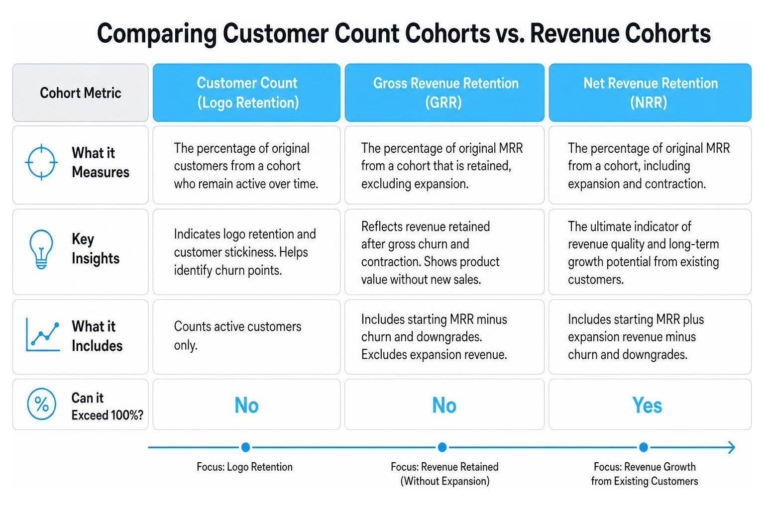
Gross Revenue Retention (GRR)focuses on how much of the original revenue from a cohort is retained after accounting for churn and downgrades. It does not include any expansion revenue. Net Revenue Retention (NRR), on the other hand, factors in expansion revenue (upgrades, cross-sells) alongside churn and downgrades. This means NRR can, and ideally should, exceed 100%, indicating that your existing customer base is growing even without new acquisitions. Comparing these two metrics within the same cohort provides a powerful view of your expansion revenue effectiveness.
Decoding the Shape of Cohort Retention Curves
The retention curve is arguably the most insightful visualization in cohort analysis. It plots the percentage of customers or revenue retained over time for a given cohort. The shape of this curve can reveal profound truths about your product-market fit, the effectiveness of your customer success efforts, and the quality of your onboarding optimization. Analyzing these decay curves helps us understand why customers stay or leave.
Shape 1: The Steep Drop and Stable Plateau
This is often considered a healthy retention curve for many SaaS businesses, particularly those targeting SMBs or with self-service models. It’s characterized by:
- A steep initial drop: This occurs in the first 1-3 months (Month 0 to Month 3). It reflects customers who quickly realize the product isn’t for them, had poor customer onboarding, or were a bad ideal customer profile fit from the start.
- A stable plateau: After the initial drop, the curve flattens significantly, indicating that the remaining customers have found value and are likely to stay long-term. The stabilization rate here is key.
Interpretation: A sharp initial drop isn’t necessarily bad if it quickly stabilizes. It suggests effective filtering of unsuitable customers or that early friction points are being addressed. The goal is to make this initial drop as controlled as possible and ensure the plateau is as high and flat as possible. A strong month 3 checkpointis often used to gauge early success.
Shape 2: The Steady Linear Decline
A curve that shows a continuous, gradual decline over many months, without a clear plateau, is a cause for concern.
Interpretation: This steady linear decline often points to an underlying problem with activation failure or value perception. Customers might not be fully adopting the product, or they’re not continuously deriving value from it. It could indicate that:
- Onboarding is insufficient:Customers are left to fend for themselves after the initial setup, leading to gradual disengagement.
- Lack of continuous value: The product doesn’t evolve or provide ongoing benefits that justify the subscription, leading to slow feature engagement and eventual churn.
- Poor product-market fit: The product solves a problem, but not a critical enough one to warrant long-term retention for a significant portion of the base.
This shape suggests that the churn problem is compounding, and the business is constantly fighting an uphill battle to replace lost revenue.
Shape 3: The Month 12 Renewal Cliff
This curve might look healthy for the first 10-11 months, but then experiences a sharp, sudden drop around month 12 (or month 24, 36, etc., depending on contract length).
Interpretation: A renewal cliff almost always points to issues related to annual contracts and the renewal process itself. Common culprits include:
- Procurement friction: Complex renewal processes, especially in larger organizations, can lead to unexpected churn.
- Price sensitivity: Customers re-evaluate the value proposition at renewal, and if the price isn’t justified, they churn.
- Lack of proactive engagement:Customer success teams might not be engaging enough with customers in the months leading up to renewal, failing to reinforce value or address concerns.
- Contractual terms: Unfavorable terms or lack of flexibility in annual contracts can drive customers away.
This shape indicates that the product itself might be sticky, but the business processes around retention, particularly for longer-term commitments, need serious attention.
Strategic Diagnostics: Solving Churn and Pricing Issues with AI-Powered Analytics
MRR cohort analysis transcends mere reporting; it’s a powerful diagnostic tool. By dissecting cohorts, we can pinpoint the precise nature of churn and pricing issues, allowing for targeted, impactful interventions.
Identifying the GRR vs. NRR Divergence Gap
One of the most revealing insights comes from comparing a cohort’s Gross Revenue Retention (GRR) and Net Revenue Retention (NRR).
- GRR tells you how much revenue you lost due to churn and contraction. It can never exceed 100%.
- NRR tells you how much revenue you retained and gained from existing customers, including expansion. It can exceed 100%.
The divergence gap between GRR and NRR is critical. If your GRR is low (e.g., 80%) but your NRR is high (e.g., 110%), it means you have significant gross churnand contraction risk, but your expansion motion is strong enough to more than compensate. This indicates that while you’re losing customers or revenue, your remaining customers are growing substantially. The focus here should be on reducing the gross churn. Conversely, if both GRR and NRR are low, you have a severe revenue quality problem.
By analyzing this gap across different cohorts, you can determine if your expansion strategies are effectively offsetting losses, or if a slowdown in expansion would expose a deeper churn problem. This helps in understanding the true health of your account expansionefforts.
Diagnosing Upstream ICP and Onboarding Failures
Cohort analysis is instrumental in connecting leading metrics (early behaviors) to lagging metrics (churn or retention).
- Leading Metrics: These are early indicators like signup rates, feature engagement in the first week, completion of onboarding steps, or time-to-first-value.
- Lagging Metrics: These are the outcomes, such as retention rates, NRR, or LTV.
If you observe a decline in the Month 3 GRR for recent cohorts compared to older ones, it’s a strong signal that something has changed upstream within the past 90 days. This could be:
- Ideal Customer Profile (ICP): Are you attracting the right customers? A shift in marketing or sales focus might bring in customers who are a poor fit and churn quickly.
- Acquisition Channels: Certain acquisition channels might bring in customers with lower customer lifetime Segmenting your cohorts by channel can expose this.
- Onboarding Process: A change in your onboarding flow, a bug in the product, or reduced customer success resources could lead to new users failing to activate and churning early.
By correlating these early-stage behaviors with later retention outcomes, we can diagnose issues before they significantly impact the overall business. For instance, if cohorts acquired through a specific channel consistently show lower payback period and higher churn, it’s time to re-evaluate that channel’s effectiveness.
Forecasting SaaS Runway, LTV, and Financial Health
Beyond diagnostics, MRR cohort analysis is a powerful engine for financial modeling and forward-looking strategic decisions. It moves us beyond gut feelings to data-backed projections for cash runway, burn multiple, and fundraising timelines.
Calculating Honest LTV via Curve Fitting
Many companies calculate LTV using a simple formula: Average Revenue Per User (ARPU) / Churn Rate. However, this naive LTV calculation often overstates LTV by 30-60% because it assumes a flat churn rate, which rarely happens in reality.
A more honest LTV calculation involves:
- Building the Cohort Retention Curve: As discussed, track actual logo or revenue retention for cohorts over time.
- Fitting a Decay Curve: Use statistical methods (e.g., negative exponential decay function) to model the observed retention curve. Tools like Excel’s Solver can be used for Solver optimization to find the best-fit parameters.
- Summing Future Retention: Project the fitted curve out to a reasonable horizon, typically a 60-month cap (5 years), which is the SaaS industry standard for LTV calculation and aligns with investor forecast horizons.
- Multiplying by ARPA and Gross Margin: Sum the projected monthly retention percentages, multiply by the average revenue per account (ARPA) for the cohort, and then by your gross margin to get a true LTV.
This method accounts for the reality that churn is usually higher early on and then stabilizes, providing a far more accurate and defensible LTV figure.
Replacing Flat Churn Assumptions in FP&A Models
One of the most common pitfalls in FP&A models is assuming a single, flat churn rate across all customers or all periods. This can lead to significantly inaccurate revenue projections and a skewed understanding of your cash-low date.
Instead, cohort decay curves should be directly integrated into your financial models. This means:
- Segmented Churn: Apply different decay curves (or retention rates) to different cohorts based on their historical performance.
- Dynamic Projections: As new cohorts are added, their projected retention should follow the patterns observed in similar historical cohorts, adjusted for any recent changes in product, market, or acquisition.
- Scenario Planning: This allows for robust scenario planning. For example, you can accurately model the impact on your runway management if churn increases by 1% in new cohorts, or if expansion revenue grows by an additional 5% due to a new pricing tier.
By using cohort-specific retention, you gain a much clearer picture of your future MRR, enabling better hiring decisions, more accurate budget management, and a more realistic assessment of when you’ll need to start fundraising.
Frequently Asked Questions about AI-Powered Analytics
What are the red, yellow, and green benchmarks for cohort GRR and NRR at 12 months?
While benchmarks can vary by industry, target market (SMB, Mid-Market, Enterprise), and product maturity, here are some widely accepted ranges for B2B SaaS as of July 2026:
- Gross Revenue Retention (GRR) at 12 months:Green: ≥ 90%
- Yellow: 80–90%
- Red: < 80%
- Net Revenue Retention (NRR) at 12 months:Green: ≥ 110% (Best-in-class companies, especially enterprise-focused, often sustain NRR above 120%)
- Yellow: 100–110%
- Red: < 100% (Meaning you’re losing more revenue than you’re gaining from existing customers)
For logo retention (customer count) at 12 months, benchmarks are typically:
- Green: ≥ 85%
- Yellow: 70–85%
- Red: < 70%
Monthly churn rates also vary by segment:
- SMB-focused SaaS: Green ≤ 3%, Yellow 3–7%, Red > 7% (after stabilization)
- Mid-market SaaS: Green ≤ 1%, Yellow 1–3%, Red > 3% (after month three)
- Enterprise SaaS: Green ≤ 0.5% per month is expected.
How often should SaaS teams review MRR cohorts and what actions should follow?
For most SaaS companies, a monthly review of MRR cohorts is standard and highly recommended. Fast-growth companies, especially those with high volume or rapid product iterations, might even benefit from weekly reviews. Quarterly reviews are less frequent but common for enterprise-focused products with longer sales cycles.
Actions that should follow from insights:
- Diagnose Early Churn: If Month 3 GRR is declining across recent cohorts, investigate changes in ICP, acquisition channels, onboarding, or initial product experience. This is an urgent signal for product and marketing teams.
- Optimize Renewal Processes: A sharp drop at Month 12 (or other annual renewal points) indicates renewal friction. This calls for proactive customer successengagement, re-evaluating pricing, or streamlining procurement processes.
- Boost Expansion: If GRR is healthy but NRR is lagging, focus on expansion motion. Identify opportunities for upgrades, cross-sells, or new feature adoption within existing cohorts.
- Refine Pricing & Packaging: Analyze which pricing tiers or packages lead to higher retention and expansion. If certain cohorts contract significantly, pricing may be misaligned with perceived value.
- Target Customer Segments:Segment cohorts by customer size, industry, or product usage to identify your most valuable customers and focus acquisition and retention efforts there.
- Update Forecasts: Integrate new cohort performance data into your financial models to ensure MRR, LTV, and runway forecasts are accurate.
What are the most common pitfalls when building or interpreting cohort analyses?
Even with the best AI-powered analytics, several common mistakes can undermine the value of cohort analysis:
- Inconsistent Cohort Definitions:Changing how you define a cohort (e.g., switching from signup date to first-payment date mid-analysis) will invalidate comparisons. Lock down your definition and stick to it.
- Using Signup Date Instead of First-Payment Date: For subscription SaaS, using signup date can include trial users who never convert, artificially inflating early retention and masking conversion problems. Always use first-payment date for paid cohorts.
- Blended Tables Without Segmentation: A single, blended cohort table for your entire customer base hides critical nuances. Always segment by acquisition channel, plan tier, customer size, or product line to uncover actionable insights.
- Changing the Definition of “Active”:Ensure your definition of an “active” customer or active MRR remains consistent throughout your analysis. Any changes will skew retention rates.
- Too Few Cohorts: You need a sufficient number of cohorts (ideally 24-36 months of data) to identify meaningful trends and stabilize retention curves. Analyzing only a few recent cohorts can lead to misleading conclusions.
- Ignoring the “Why”: Cohort analysis tells you what is happening and when. The real work is digging into the why—connecting observed patterns to specific product changes, marketing campaigns, or customer success initiatives.
- Not Tracking Both GRR and NRR:Relying on one without the other gives an incomplete picture. NRR alone can mask significant churn if expansion is strong, while GRR alone doesn’t show the growth potential from existing customers.
- Flat Churn Assumptions in Forecasting: As discussed, using a single, flat churn rate for future projections is inaccurate and can lead to overoptimistic forecasts.
Conclusion
MRR cohort analysis is not just a metric; it’s a strategic lens through which we can truly understand the pulse of our SaaS business. By moving beyond aggregate numbers and diving into the granular performance of customer groups, we unlock unparalleled insights into retention, expansion, and churn dynamics.
This guide has walked through the essentials: from distinguishing cohort analysis from standard reporting, to building and interpreting the powerful triangular matrix, decoding the shapes of retention curves, and leveraging these insights for strategic diagnostics and robust financial forecasting. Embracing this level of detail empowers data-driven decisions that optimize product-market fit, improve customer lifetime value, and ultimately drive sustainable growth.
In an increasingly competitive landscape, the ability to perform accurate, timely, and insightful cohort analysis is no longer a luxury but a necessity. With the rise of AI-powered analytics and automated reporting, these sophisticated insights are becoming more accessible than ever, transforming revenue operations into a proactive engine for strategic growth.